Our Favorite Museum Websites (And What You Can Learn from Them)
Tasked with driving ticket sales and donations while also sparking a sense of wonder and awe, these five museum websites are best in class.
By Erica Harmon
The best museum websites do more than inform — they invite. They offer a digital doorway into a physical place, capturing the spirit of the institution while making it easy for visitors to engage from wherever they are. The best museum websites ites feel alive with purpose and possibility. They spark curiosity, guide trip planning, surface educational content and encourage support through membership or donations — all while reflecting the museum’s brand and mission.
Of course, getting all that right takes more than a pretty design. It requires a clear content strategy, intuitive UX and storytelling that connects with real audiences, whether they’re planning a visit, looking for a specific artifact or just exploring from afar.
Here are four museum websites that stand out for doing exactly that — and might just spark ideas for your museum’s next website redesign.
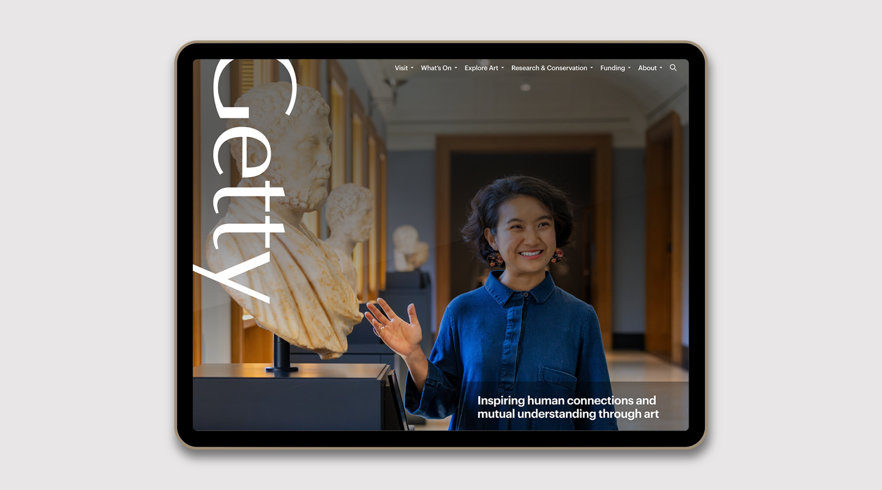
Getty Center
Lesson: Make Navigation Effortless
The Los Angeles–based Getty is more than just a museum — it’s a cultural powerhouse with two stunning campuses, a world-class collection, ambitious research and conservation efforts, and a constant stream of exhibitions, public programs and digital content. With so much to offer, the website could easily feel overwhelming — but it doesn’t. Instead, it’s a masterclass in clarity and structure. Whether you’re planning a visit, researching an artwork, exploring educational resources or diving into a conservation story, everything is easy to find and beautifully presented. The site’s clean design and straightforward navigation allow Getty’s content to shine — no jargon, no guessing, just thoughtful organization that respects the user and celebrates the art.
Just as important, the site is structured and written with discovery in mind — not just for people, but for search engines and AI tools. Key visitor info like hours, ticketing, parking, and exhibition details are clear, scannable and easy to surface. This ensures the essentials are accessible whether someone lands on the homepage or finds the museum through a voice assistant or Google search
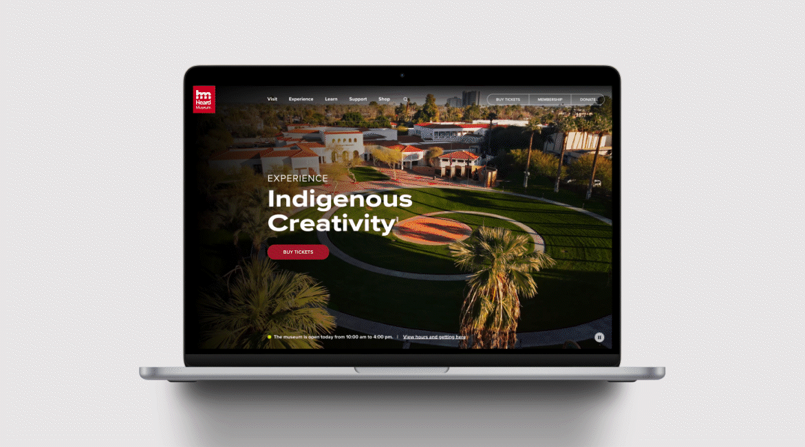
Heard Museum
Lesson: Create a Digital Experience That Feels Like Being There
Since its founding in 1929, the Heard Museum has grown in size — and stature — to become recognized internationally as one of the world’s preeminent museums for the presentation, interpretation and advancement of American Indian art. When the Heard team asked us to reimagine its website, our goal was to create more than just a digital portal — we aimed to reflect the depth, beauty and presence of the museum itself.
The new homepage opens with a marquee that’s as much about the art as the experience of being on site. Sweeping drone footage captures the full scale of the Heard’s campus, including its indoor galleries, outdoor courtyards and performing spaces. Visitors are shown in motion — walking through exhibits, gathering in shaded spaces, experiencing performances — giving an immediate sense of place and community. Throughout the site, bold imagery showcases not just the collection, but the people engaging with it. Galleries feel alive with color and movement, and the design strikes a balance between reverence for tradition and the energy of a contemporary cultural destination. It’s not just about what the Heard holds — it’s about how it makes you feel.
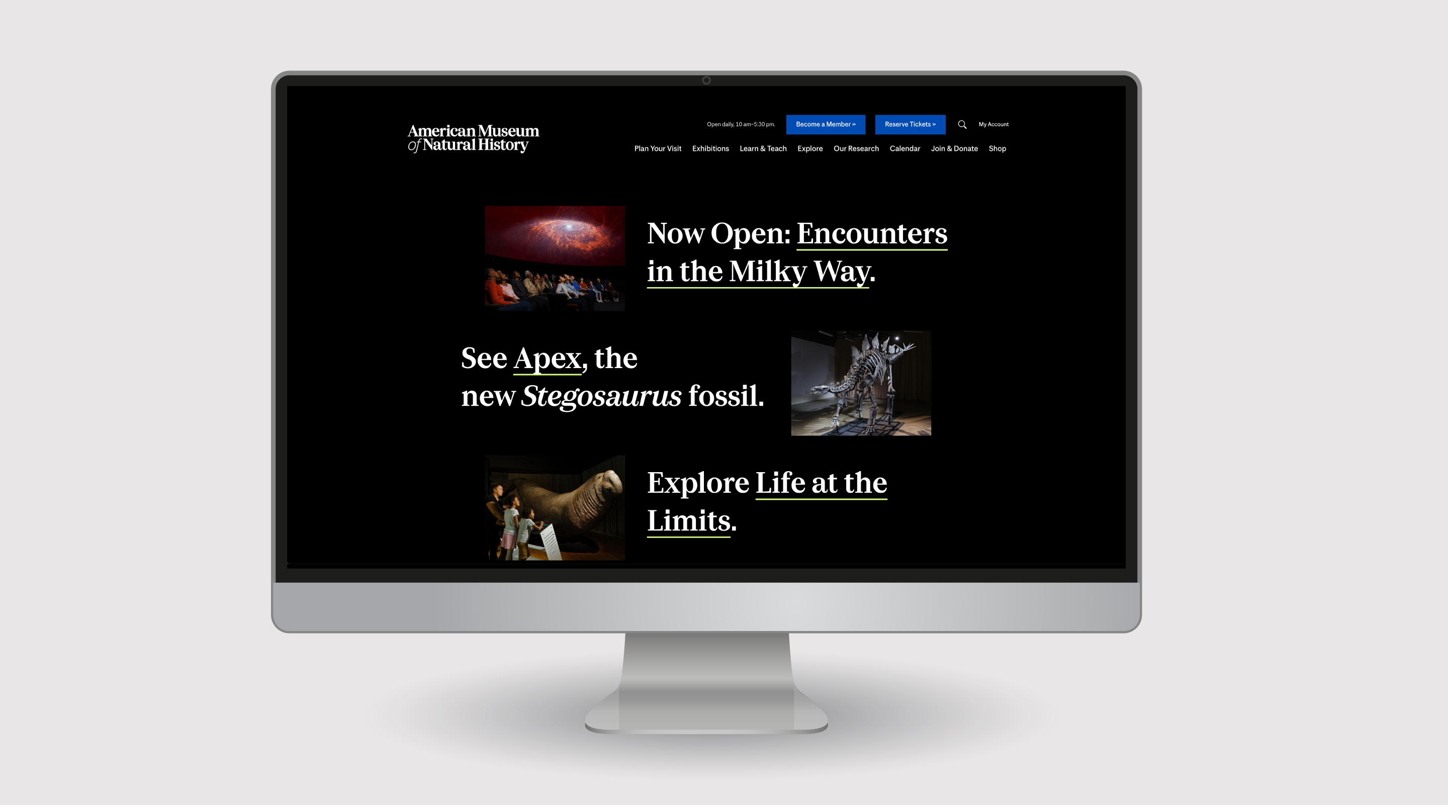
American Museum of Natural History
Lesson: Make Giving and Membership Feel Meaningful
The American Museum of Natural History invites curiosity at every click. Its homepage feels like a digital extension of the museum itself — layered, lively and built for discovery. Whether you’re diving into dinosaur facts, planning a family visit or getting lost in a virtual exhibit, the site makes it easy to explore its deep well of content. Beautifully organized, it balances fun and function across education, exhibitions and research. The generosity of supporters fuels much of what the museum does, and the Join & Donate section reflects that spirit. From memberships and benefit events to planned giving and corporate partnerships, it’s easy to find a way to contribute — and see exactly how your support makes an impact.
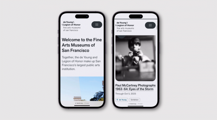
Fine Arts Museum of San Francisco
Lesson: Design for Your Mobile Users
The shared website for the de Young and the Legion of Honor — the Fine Arts Museums of San Francisco — is a great example of how thoughtful design can elevate a digital experience without getting in the way. Built with a clear mobile-first approach, the site leans into tall, striking imagery that looks stunning on a phone and scrolls beautifully across devices and platforms. Clean layouts, generous white space and subtle design flourishes — like rounded corners and a palette of soft, neutral grays — give the site a sense of warmth and elegance that mirrors the museums themselves.
It’s a design that understands its role: to support the art, not compete with it. But it also brings just enough personality to make the experience feel human and current. Whether you’re browsing exhibitions, planning a visit or just taking in the breadth of the collections, the site is both intuitive and inviting — a modern extension of two of San Francisco’s most iconic museums.
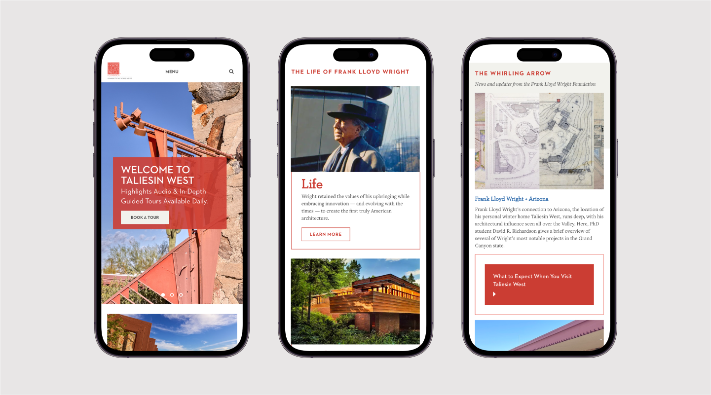
Taliesin West (Frank Lloyd Wright Foundation)
Lesson: Let Design Tell a Story
Taliesin West, Frank Lloyd Wright’s beloved winter home and desert laboratory, is a UNESCO World Heritage site and National Historic Landmark nestled in the foothills of the McDowell Mountains in Scottsdale, Arizona. Deeply connected to the desert from which it was forged, this architectural icon possesses an almost prehistoric grandeur and is among the most personal of Wright’s creations, so it’s only fitting that its website feels like an extension of his singular style. Sparing use of Wright’s signature red draws attention and entices users to click, while subtle uses of sky blue and prairie-field green echo his deep reverence for nature. Geometric shapes that inspired and grounded so much of the architect’s work punctuate headlines and interactive elements, tying form and function together in a way Wright himself might admire.
But the site isn’t just beautiful — it’s accessible, well-structured and thoughtfully narrated. From clear wayfinding to strong color contrast and clean typography, the experience is designed to work for everyone. And rather than just offering facts, the content brings Wright’s philosophy to life, drawing visitors into the story of Taliesin West as a living, evolving space.
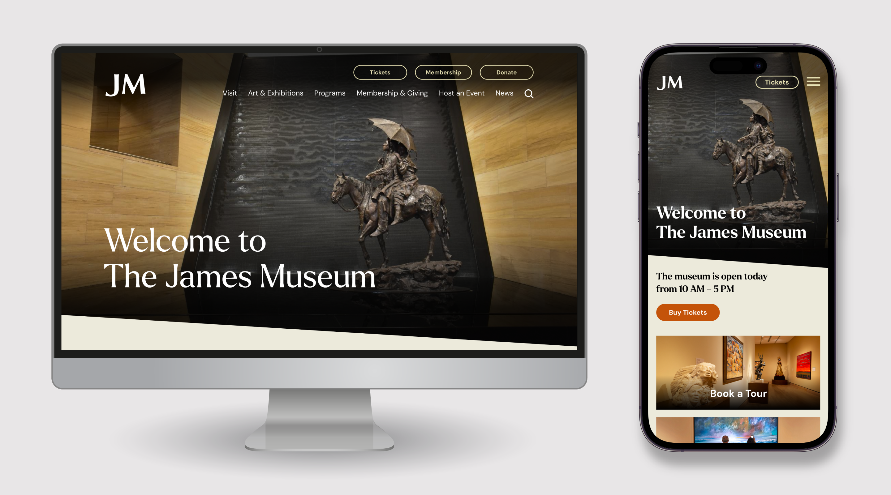
The James Museum of Western & Wildlife Art
Lesson: Serve Your Local Community
The James Museum is a stunning space — built to evoke the sandstone canyons of the American West, filled with natural light and more than 400 works of sculpture, painting and jewelry. Our team designed the website to reflect that same sense of place and purpose. Rich visuals highlight the museum’s distinctive architecture and powerful collection, while carefully curated content adds context — bringing history, voices and landscapes to life
But what makes the website especially effective is how it serves the museum’s broader mission: educating and engaging its local community in Tampa, Fla. Whether you’re a first-time visitor or a frequent guest, the site makes it easy to explore what’s on view and get involved. Events, book clubs, family programs, summer camps and school partnerships are all front and center — reinforcing that The James isn’t just a destination, it’s an active part of life in St. Petersburg.
Does Your Website Need a Redo?
We can redesign your museum’s website with your goals in mind.

Erica has more than a decade of experience leading messaging development, content strategy and magazine projects for clients in the higher education, hospitality, book publishing and museum industries. At C/A, she helps clients such as Crystal Bridges Museum of American Art, Niagara Falls USA and Northern Arizona University bring their unique stories to life.
Erica enjoys traveling to places that have pop culture connections: She’s seen all the Goonies sites in Astoria, Oregon, flown through time and space with Doctor Who in Cardiff, Wales, and sang on the Sound of Music hills in Salzburg, Austria. She loves books, magazines, road trips, Broadway musicals and cottagecore activities such as gardening and sewing, but her favorite thing to do is spend time with her fiancé and stepcat.