The Art of a Logo Refresh
Yes, you can update your logo to better reflect where your organization is heading without starting from scratch.

By Rebecca Au-Mullaney
At some point, all logos start to feel a little … staid. You’ve seen big brands like Starbucks, Coca-Cola and McDonald’s make tweaks over the years, without throwing out the bones of their existing, recognizable logos. If it’s time for your own refresh, we’ve got a few tips for you.
1. Revisit the shape relationships within your logo.
When you think of your existing logo, is there a way to rearrange the elements so that the shapes tell a better story?
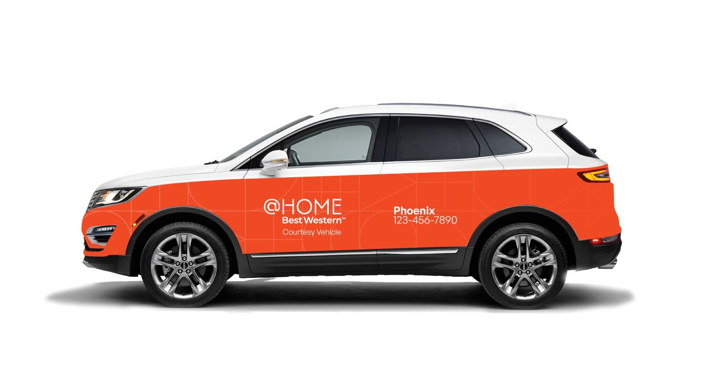
When Best Western tapped Casual Astronaut for help with its extended-stay segment, @HOME by Best Western, we could see that the initial logo direction needed a few refinements. A series of small changes, like adding a diagonal finish to the horizontal stroke of the “H” to echo a treatment already present in the “E,” helped create a mark that feels refined and cohesive.

As a secondary branding element, we simplified and abstracted each letter in “HOME” to create a pattern that echoes architectural blueprints and tile mosaics. Most audiences won’t consciously notice these connections, but these design choices create subtle visual and conceptual connections that can strengthen the brand’s message.
2. Expand your logo’s usability.
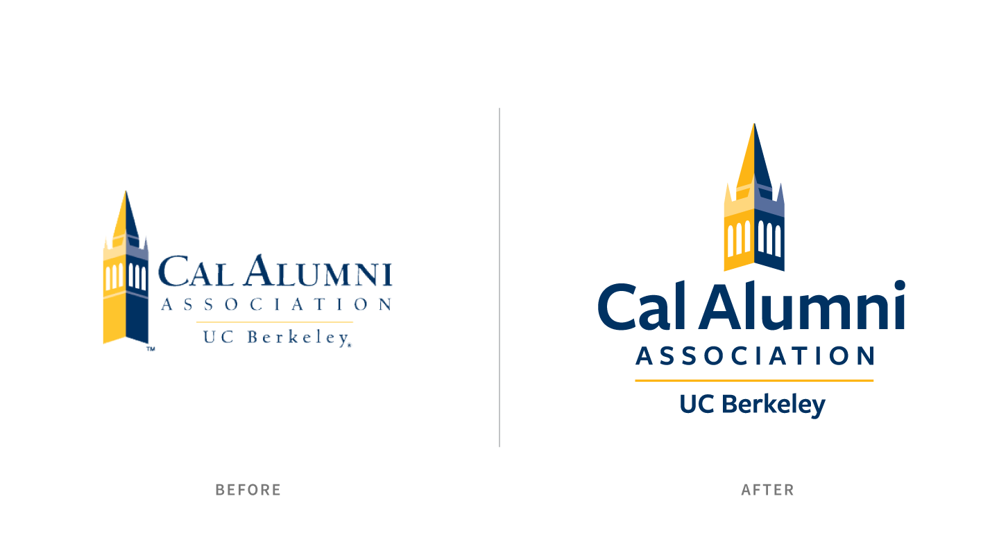
Sometimes a logo refresh is necessary to expand usage possibilities. C/A was tasked with updating the Cal Alumni Association’s logo so it would read more easily in digital contexts such as email, social and the Cal Alumni website. Whereas the old logo placed the iconic Sather Tower graphic to the left of the text, we shortened the tower and centered all the elements to improve readability at smaller sizes. While the logo redesign prominently features the university’s recognizable Berkeley Blue and California Gold, it’s also simple enough that it can be easily reproduced in black and white.
Additionally, we created a version of the tower that could stand on its own — a perfect social media avatar (and an obvious favicon choice for the alumni website, which we also designed and built).

3. Make space for new taglines and sub brands.
Flexibility was also at the forefront of our logo redesign process when we updated the branding for Discover St. Louis Park. We redrew the existing logo to improve its legibility and presence at small sizes and paired it with a clean, confident wordmark. Alternate versions of the logo include a variable tagline that can seamlessly accommodate new initiatives — “Minnesota’s Sweet Spot” can easily become “Minnesota’s Meeting Spot” or “Minnesota’s Family Spot.”
A sturdy logo with space for variation means that as the DMO rolls out new messaging targeting different audiences, viewers will still experience the brand in consistent way.
Is Your Brand System Working for You?
We can help support your evolving brand with flexible logo and icon design options that will stand the test of time.

