6 Simple Ways to Improve Your Alumni Magazine Design
Try these quick-and-easy tricks to make your alumni magazine a colorful keeper.

By Erica Harmon
University magazines proudly display their school colors, but they don’t always make a splash. Done well, these publications instill a sense of pride and foster connections with alumni. Done great, they can nourish relationships with donors, faculty and students, promoting a university’s brand while presenting its accomplishments to the world. But if your magazine is a hodgepodge of poor design, then it likely will wind up in next month’s recycling bin. To avoid this, keep these simple design tips in mind to ensure your alumni will read, savor — and keep — their next issue.
Don’t be afraid of colorful ideas. Go bold with your university’s color palette — and have fun with it, too.
1. Share colorful ideas.
“Be bold and mighty forces will come to your aid.” The German writer Johann Wolfgang von Goethe clearly had university magazines in mind when he said these wise words. And he was right! Don’t be afraid of colorful ideas. Go bold with your university’s color palette — and have fun with it, too. Leverage that school spirit in vibrant and unexpected ways to keep things fresh and (seemingly) new as you produce each edition of your magazine. Ideas:
- Large fields of bold color for backgrounds
- Screens and overlays to lift weak or disparate imagery
- Assign a signature color to recurring departments
- Use color as a storytelling device
- Use color to spotlight data and impact
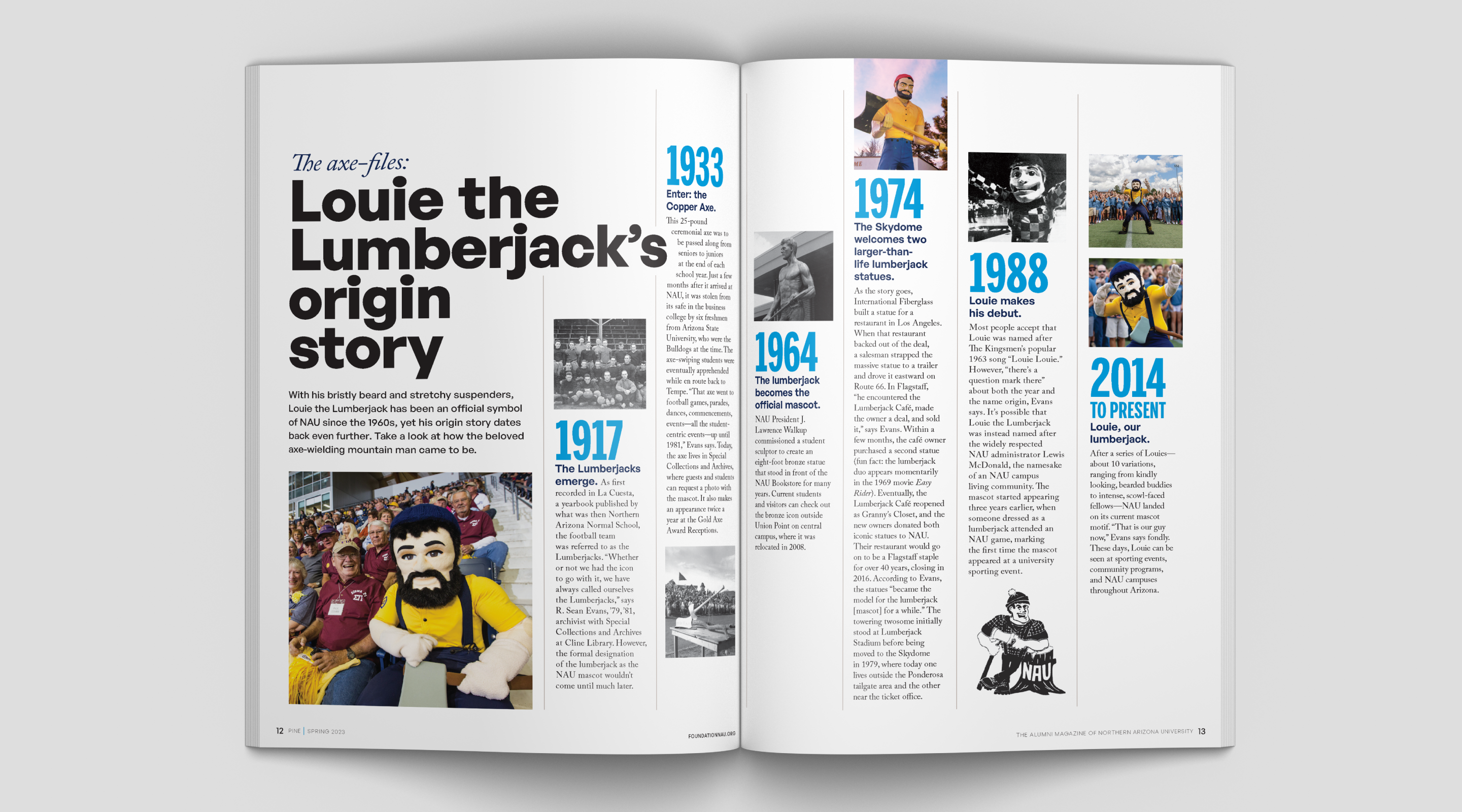
2. Dust off those old black-and-whites.
On the flip side, archival photographs and documents can bring the history of a university to life and instill a sense of belonging to something larger than yourself. For example, Pine magazine, the alumni magazine for Northern Arizona University, features a back-of-book section called “Final Frame,” which showcases photos from their library archives curated around a specific theme. Pine also utilizes these vintage photos to evoke nostalgia, such as this “origin story” timeline of their beloved mascot, Louie the Lumberjack, which dates back to the early 20th century.
3. Stylize your templates.
As you develop your editorial lineup, consider non-traditional templates and formats to shape your design. These features and layouts leave room for design to stretch its legs:
- “By the numbers” + stats
- Checklists
- Sidebars
- Q&As
- Quizzes
- Timelines
- Then and now side-by-sides
Consider the flow of story formats throughout your issue. Separate long narratives with smaller features or full-page images to provide readers some relief.
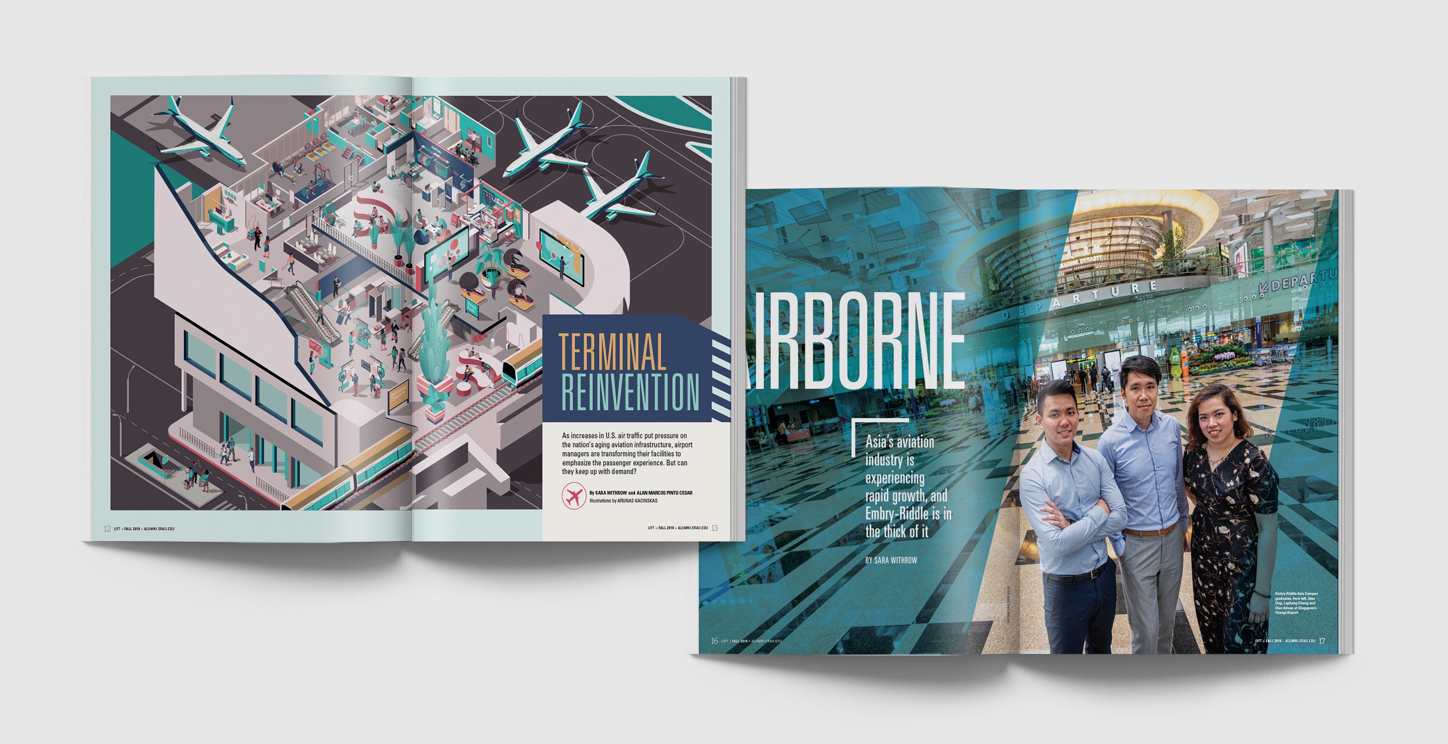
4. Illustrate abstract concepts.
Often, a story will feature abstract or futuristic concepts for which photography or existing materials will not suffice. In these cases, seize the opportunity to work with an illustrator to imbue some life into what doesn’t (yet) exist. For their alumni magazine, Lift, Embry-Riddle Aeronautical University wanted to showcase “the airport of the future,” sharing in-the-works innovations that were still in development. C/A partnered with an illustrator to create a sleek and unique design that also showcased Embry-Riddle’s brand colors.
5. Don’t sleep on small details.
Get creative with branding and design in the small places like footers, pagination, department headers and white space. Little details can go a long ways. Think subtle icons and rules — or wayfinding treatments to pump your table of contents and text-heavy Class Notes sections.
That can extend to features, too. In a 1990s-themed spread of “Final Frame” in Pine magazine, C/A incorporated neon colors, geometric shapes and icons such as roller skates and cassette tapes to immerse readers in the fun of the era.
6. Fear not stock imagery.
If your photography isn’t the right fit, there are many low-cost stock image options out there. Some of the great (and free!) image sources we like are Pixabay, Unsplash or the Noun Project for icons. You can easily find imagery that pairs with and complements your original photography
- Pull a simple, line-art icon to punctuate sidebars, stats or pull quotes when you don’t have section-specific photos.
- When a story calls for a broader mood or big concept, use a clean, abstract stock image that supports the theme without overpowering your real photography.
- Drop-in inset imagery for detail shots that may be missing.
If commissioning a custom illustration is cost-prohibitive, Getty Images and Adobe Stock also offer stock illustrations that you can adapt for your specific needs.
Small, thoughtful choices like these go a long way in keeping your alumni magazine fresh, impactful and unmistakably yours.
Delight and Engage Your Readers
Ready to make your university magazine coffee table-worthy? We can help.

Erica has more than a decade of experience leading messaging development, content strategy and magazine projects for clients in the higher education, hospitality, book publishing and museum industries. At C/A, she helps clients such as Crystal Bridges Museum of American Art, Niagara Falls USA and Northern Arizona University bring their unique stories to life.
Erica enjoys traveling to places that have pop culture connections: She’s seen all the Goonies sites in Astoria, Oregon, flown through time and space with Doctor Who in Cardiff, Wales, and sang on the Sound of Music hills in Salzburg, Austria. She loves books, magazines, road trips, Broadway musicals and cottagecore activities such as gardening and sewing, but her favorite thing to do is spend time with her fiancé and stepcat.