What Makes a Great Nonprofit Website? 6 Sites That Get It Right
A successful nonprofit website does more than ask for donations — it tells a story, builds trust and makes it easy for visitors to explore, learn and engage. These examples show how thoughtful design and strategy can support your mission at every click.
By Leigh Flayton
The not-for-profit world is a crowded arena, with countless worthy missions competing for financial support. That means that a key component of every nonprofit website design is incorporating donation calls to action. But the really good nonprofit websites don’t stop there. They engage donors on a deeper level by highlighting their distinctive perspectives and impact at every turn in the user experience.
Casual Astronaut recently launched three such sites that balance appeals for donations with storytelling and strategy.
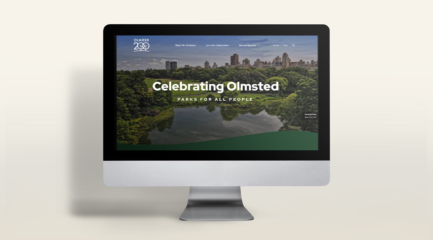
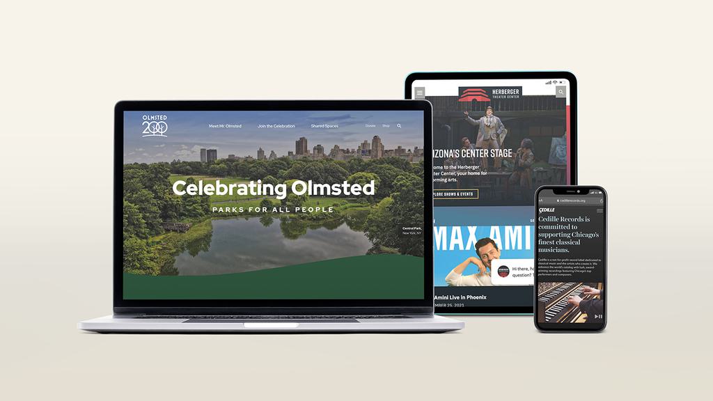
Olmsted Network
Frederick Law Olmsted shaped the American landscape — quite literally. As the visionary behind Central Park, the U.S. Capitol Grounds and hundreds of other iconic places, he pioneered the idea that public parks are essential to democracy, health and community. Today, the Olmsted Network carries that mission forward, advocating for the preservation of his work and the progressive values he championed: access to nature, social equity and environmental sustainability. The website brings that legacy to life through layered storytelling, intuitive design and a rich mix of resources. Built to welcome both longtime advocates and curious newcomers, it guides visitors through Olmsted’s ideas and the thousands of landscapes across the country that reflect them — inviting exploration, learning and action along the way.
To better reflect its mission and drive ticket sales, the Tucson Symphony Orchestra partnered with C/A to reimagine its website from the ground up. The new site balances elegant design with real functionality: intuitive navigation, bilingual content, seamless Ticketmaster integration and a flexible backend that supports evolving needs. Designed for first-timers and longtime subscribers alike, the site captures the spirit of the symphony while delivering a modern user experience that supports community connection, storytelling and conversion. (See full case study.) Cedille Records, a Chicago-based classical music recording company, was founded in 1989 by a classical music lover who wanted to share his passion for the local scene and support the Windy City musicians he so admired. When C/A redesigned the site, we were tasked with creating a vibrant and contemporary digital experience that would further the nonprofit’s mission to “bring Chicago’s finest classical musicians to a worldwide audience by recording, distributing and promoting their work.” Ways to donate to Cedille are promoted throughout, but the site itself is perhaps most successful for its use of striking photography, audio and video to immerse users in the local music scene. This in turn doubles as a way to inspire support not only of Cedille as an organization, but also for the artists, community and larger audience it serves. (See full case study.) The Preservation Resource Center of New Orleans preserves the city’s iconic architecture — and needed a website that could do the same. C/A redesigned PRC’s digital presence into a visually vibrant, highly functional site that reflects the spirit of New Orleans while solving key usability challenges. With a restructured menu, streamlined content hub, CRM integration and a custom-built interactive map, the new site empowers both staff and users — and invites repeat visits through storytelling, design and seamless navigation. (See full case study.) The Herberger Theatre Center, a performing arts complex in Phoenix, is home to five resident companies, but it’s also a community space that goes beyond the performing arts. The goal of a recent rebranded and revamped website was to sell tickets and promote its resident companies, of course, but also to establish the Herberger Theater as a cultural hub and one of Arizona’s premier destinations. As a result, the new site reintroduces the Herberger Theater as more than just a place to see shows. It highlights the performing arts center as the versatile setting that it is, showcasing the many opportunities it offers in the heart of downtown Phoenix — as a destination wedding location, festival host, community activity center, corporate meeting space, a vibrant place to grab drinks, see art and listen to live music. This helps to further establish the Herberger Theater as a multidimensional and integral part of the city. The Charlotta Bass Journalism & Justice Lab at USC Annenberg needed a website as bold and layered as its mission: to preserve, study and share the legacy of Black media. C/A designed a site that’s immersive, intuitive and deeply mission-aligned — combining archival imagery, interactive timelines and integrated tools for events, podcasts and an AI-powered oral history archive. Built for students, researchers and the public alike, the site brings together the Lab’s work in one dynamic platform designed for access, engagement and growth. (See full case study.)Tucson Symphony Orchestra
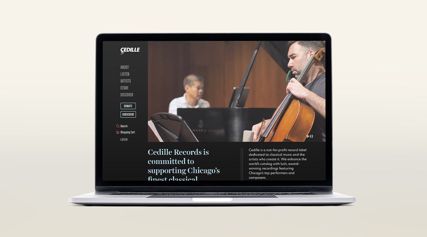
Cedille Records
Preservation Resource Center of New Orleans
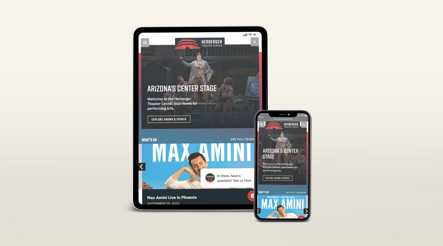
The Herberger Theater Center
USC’s Bass Journalism & Justice Lab
Is Your Nonprofit Website Everything It Should Be?
We can help design and develop a site that’s rooted in strategy.

Leigh is an award-winning editor and writer whose work with C/A focuses on healthcare, education and travel for clients such as NYU Langone Health, the University of Arizona and Niagara Falls USA. Before joining C/A, Leigh founded and edited Mukhtar Mai Women’s Welfare Organization’s international newsletter and, since 2014, she has served as a senior media advisor to the CEO of To The Market Survivor-Made Goods.
Leigh is a Senior Editor at C/A. For nearly 10 years, she was Editor-In-Chief of Arrive magazine. As a writer, she has contributed to The New York Times, the Los Angeles Times Magazine, Huffington Post, LENNY and Refinery29, among other publications. Leigh is also an avid tennis player and skier, arts lover and playwright. She lives in New York City.